The Project
For this solo project, I was tasked with redesigning the homepage and top two layers of navigation of a government agency website. I selected the Department of Homeland Security (DHS), mainly because it had the most pages in its navigation and looked like a fun challenge.
The current DHS.gov
Research
I first wanted to identify who the users of the website were. Because the DHS is an oversight agency, many of the pages on it are just links to the agencies under it. I decided that the users I wanted to target most were those coming to DHS.gov for something they couldn't get to from another agency website. I searched through and selected four pages that served a novel public function, skipping those that were clearly geared toward press, researchers, and agency staff. I also mapped out the path a user would have to follow for one of the tasks. At this point, I was hoping to build out an updated process in the final prototype, but time constraints on the project forced me to change the plan.
With four functions selected, I built a testing plan to see how usable the website was. I created tasks with scenarios corresponding to the functions and gathered my participants. I also built the scenarios using different wording than is on the site to discourage searching or "find on page" functions.
As the frantic scrolling above shows, participants found the tasks to be frustrating. The target pages were often buried in headings that participants felt didn't make intuitive sense. Users also found that the search functionality on the site was limited and often got buried looking through 15+ pages before eventually finding what they were looking for in the normal navigation.
Information Architecture
After testing, I gathered up every page on the site and began to reorganize them in a way that fit the needs expressed by my participants. I also removed the pages that weren't actively being used to help cut down on the larger sections.
As I iterated on the navigation, I continued to solicit and incorporate new feedback from the earlier participants to ensure the revised categories were working better.
Mobile-First Prototyping
I started prototyping by building out a mobile version of the navigation system I had laid out. The first version used two layers of horizontally scrolling options. My second iteration, however, removed this as it was hiding too many options. In place of this, I opted for a hamburger menu that popped out a side navigation panel.

First Iteration
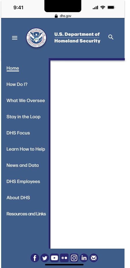
Second Iteration with Side Navigation Open
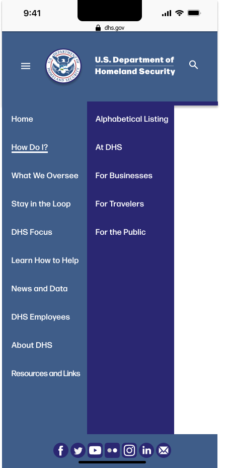
Second Iteration After Selecting Category
I tested these versions in a handful of A/B tests where I gave participants both and asked which they preferred. The tests confirmed my change solved the user issues, so I moved forward with my desktop version.
Adapting to Desktop
I tried to match the feel of the desktop version to my mobile navigation. The first iteration felt crowded and off-balance. With feedback from my peers, I was able to better solve these issues, as well as fix the animation issues I was having with the rolling-out subcategory options.
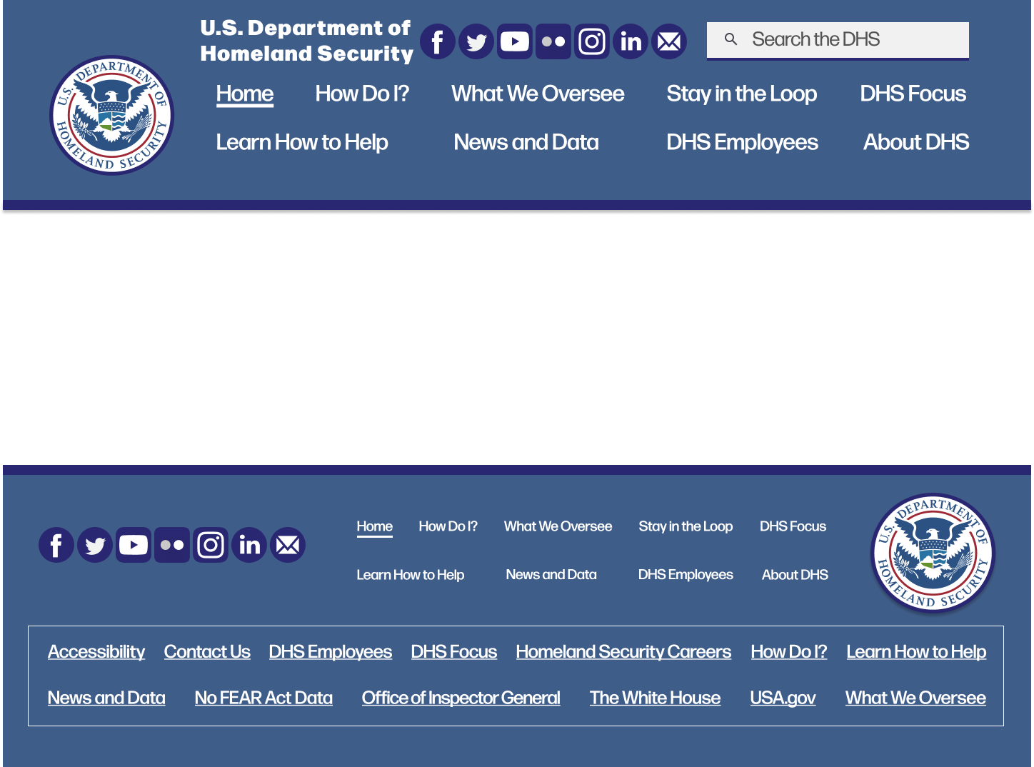
First Iteration
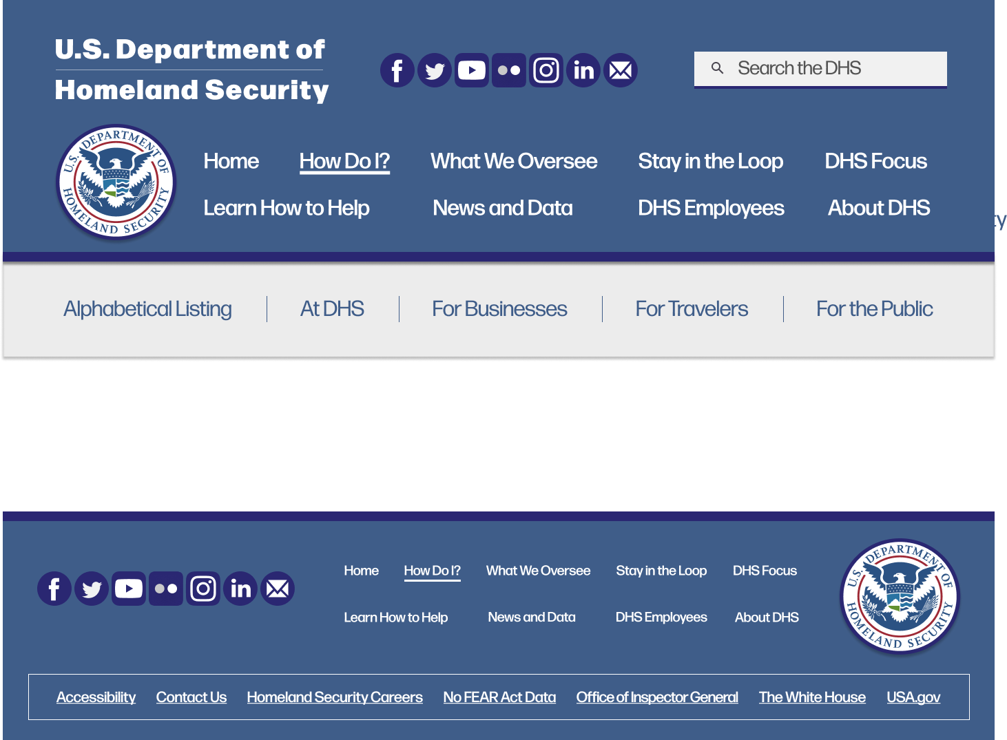
Second Iteration with Category Selected
With a selection of photos composed of free stock images and publicly available DHS-made photos, I built content relevant to the DHS at the time. Leveraging my skills with color correction and photo editing, I shaped the content and pictures to be evocative and to draw the eyes while fitting the official and secure feel that the DHS wants to convey.
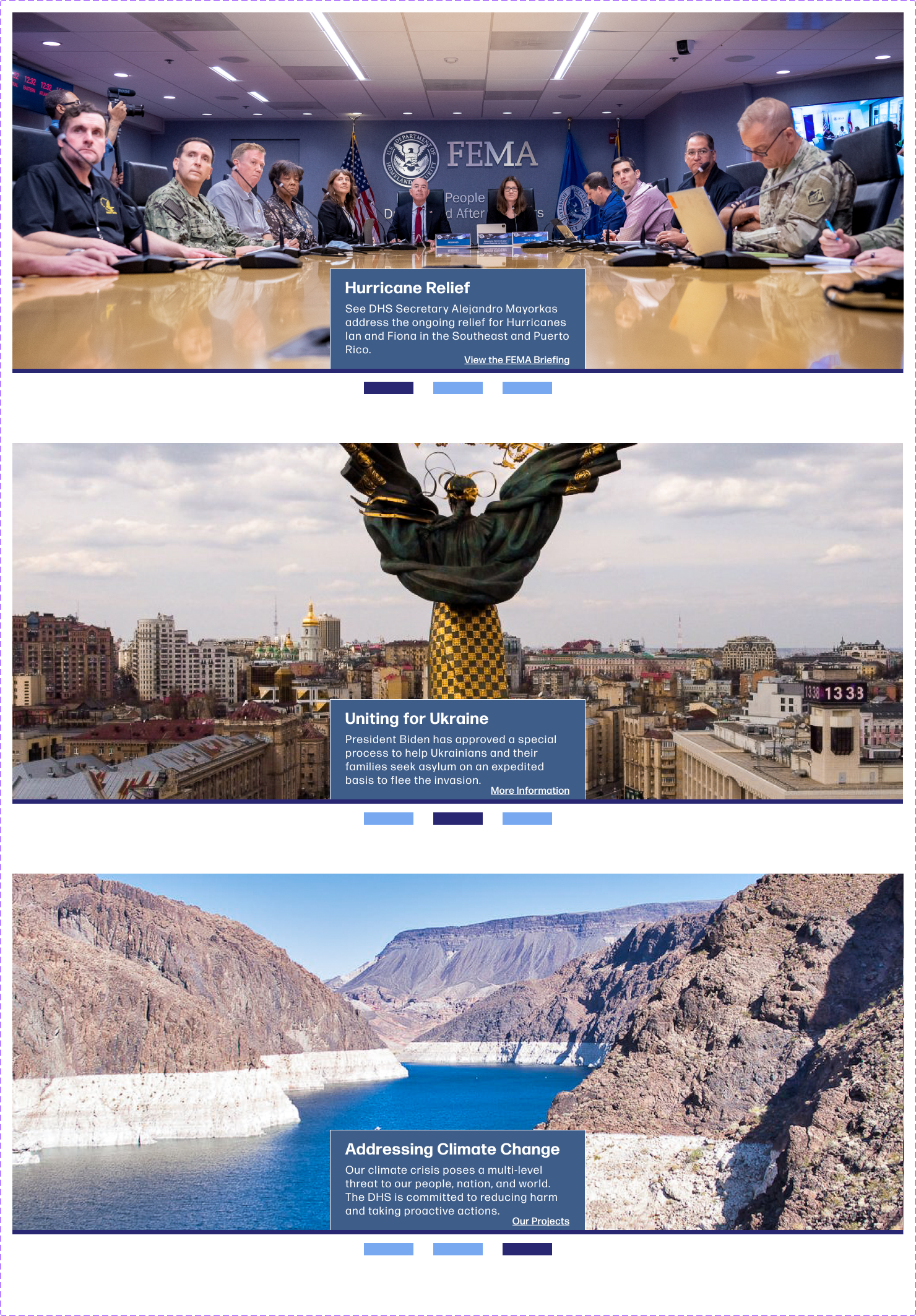
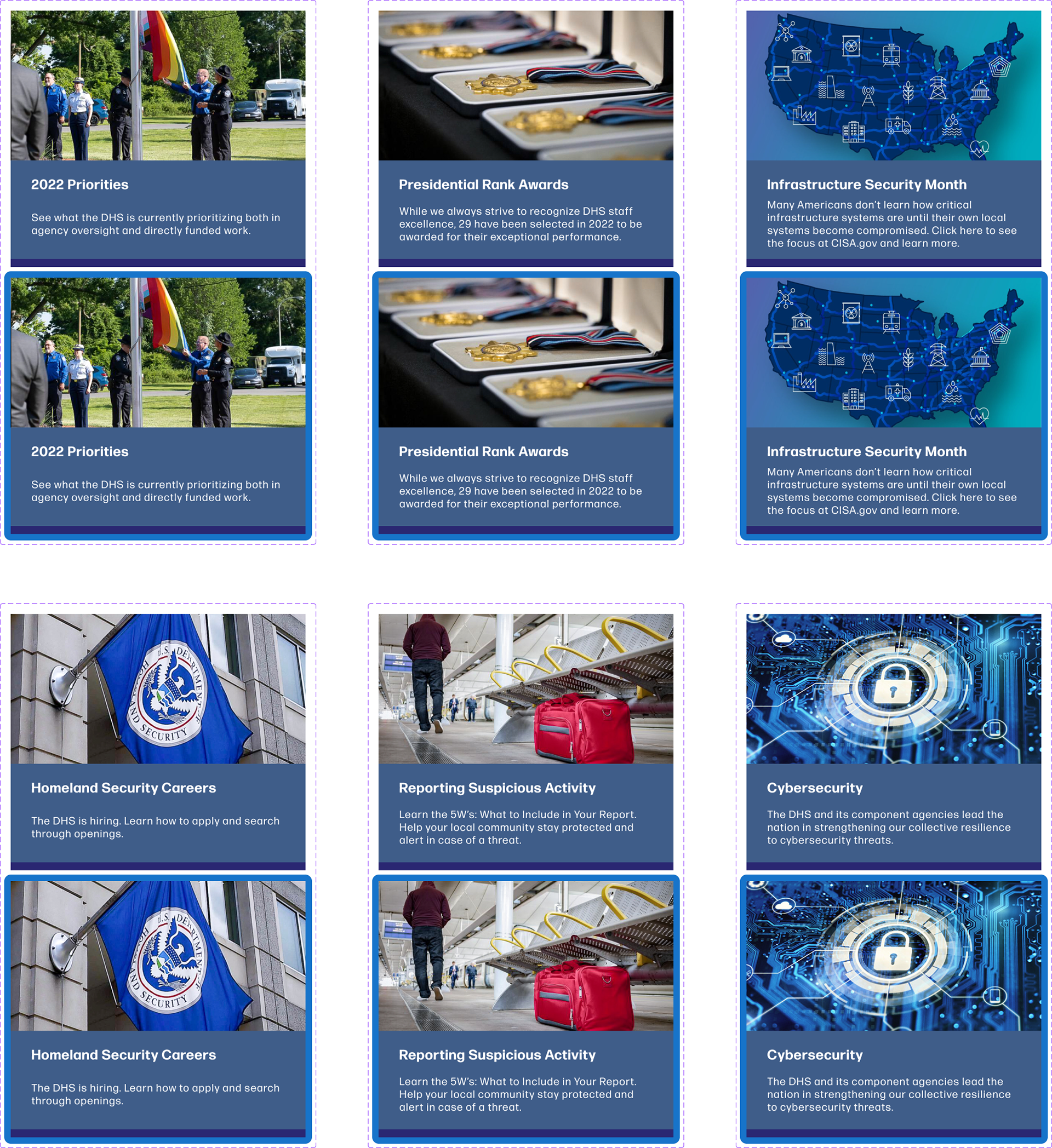
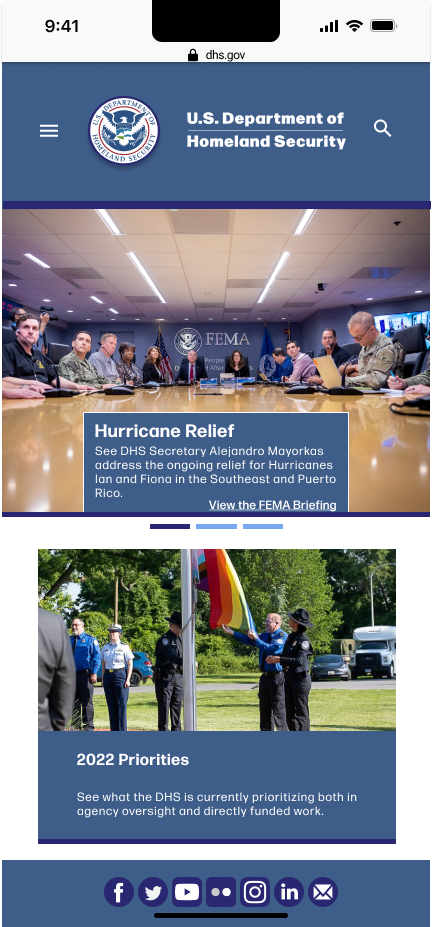
With my content fleshed out, I adapted it back into mobile, making adjustments when needed to keep it readable and accessible.
User Feedback and Concluding
Before finalizing my project, I wanted to get a lot of user feedback to improve it as much as possible. To do this, I gathered ten participants and had them complete a few small tasks to find items in the navigation, and then had them provide positive and negative feedback about the site experience.
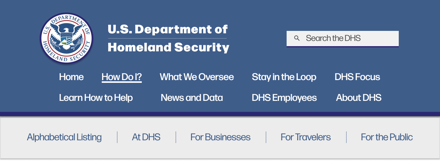
My desktop header got the most feedback. Most participants didn't like the rollout menu, even after I updated it to fit the style better for the later participants. For the users, it felt clunky and cluttered. This led to my choice to change it to a drop-down, which allowed the subcategories to all be evenly spaced and clearly separated from each other.


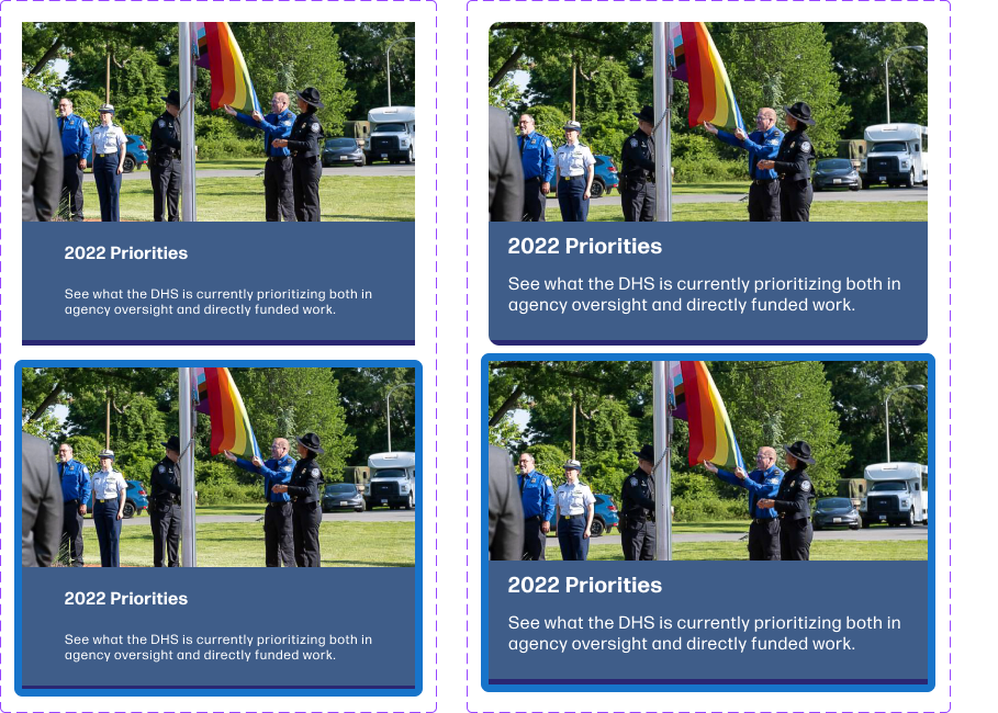
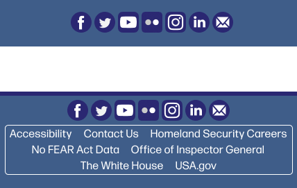
I also got feedback on the content cards and mobile footer. My cards were often hard for participants to read; I solved this by changing how they were laid out and proportioned. Some also felt that the mobile footer should have more information. Originally, I put the desktop footer content in its own navigation category called "Additional Links". Users didn't find this new location easily, so I put the core footer content back in and kept it in both places.
Having incorporated as much of the feedback as I could given the time constraints, I finalized both versions of the home page.
Try it Out
Mobile
https://www.figma.com/proto/CFlFV30hB2K030fS78Q32e/Prototype-DHS-Mobile-Site?type=design&node-id=0-1&viewport=591%2C-1152%2C0.12&scaling=scale-down&starting-point-node-id=167%3A1136&show-proto-sidebar=1
Desktop
https://www.figma.com/proto/LGNmBKtgPxKFWqNV26pudR/Prototype-DHS-Website?type=design&node-id=0-1&viewport=521%2C-3537%2C0.08&scaling=scale-down&starting-point-node-id=369%3A1976&show-proto-sidebar=1
Copy and paste the links into your URL bar to view.
