The Project
In teams of four, we were tasked with choosing a charity and redesigning it for desktop and mobile. Given my own love of the charity Modest Needs, we had an easy time deciding on one to focus on. The website was definitely in need of help, though.
The Team
For this project, I worked with three fellow students in my UX/UI cohort and current designers: Andrea Ceballos, Madison Orr, and Patrick McCourt.
My Role
For this project, we took a very team-focused approach to the research and ideation portions. Through these, we worked collectively, trying to shape the direction of the scope and goal of the project. For the latter half of the project, my efforts were focused on restructuring the information architecture of the website, building the content cards that showcase the applicants on the site, and designing the page that would allow users to browse applicants.
Research
We started by making a rough persona (above). To better understand our targeted "Donor" category, we decided that the best group to target our research toward would be those who give monetarily to charity at least once per year. We asked eight participants questions about their general giving habits, what made them more likely to give to a charity, and what red flags they may look for. With this, we were able to synthesize John into our final persona.
Next, we looked into other "competitor" charities and evaluated them. We drew a lot of inspiration from sites like Kiva and GoFundMe. They were able to present applicants through cards in a way that evoked emotion, while also making each donation feel like tangible progress toward the goal.
Defining the Problem
With subsequent tests using the site, we found that users were overwhelmed with it, feeling like the cluttered nature of it made it harder to trust. This matched our prior findings that charities without easily found impact data were harder for donors to feel like they were safe giving to.
Some respondents needed to see impact data to feel secure in their giving. Many wanted to know that their money wasn't going to high organization fees. Some even wanted to hear from those they help after to know if their money made a difference. Most of these expressed heuristics in evaluating charities could be condensed into donors feeling like they need to be sure their money was having an impact. We mapped out the user concerns with our persona, John, to better visualize how he would be thinking.
Solving the Problem
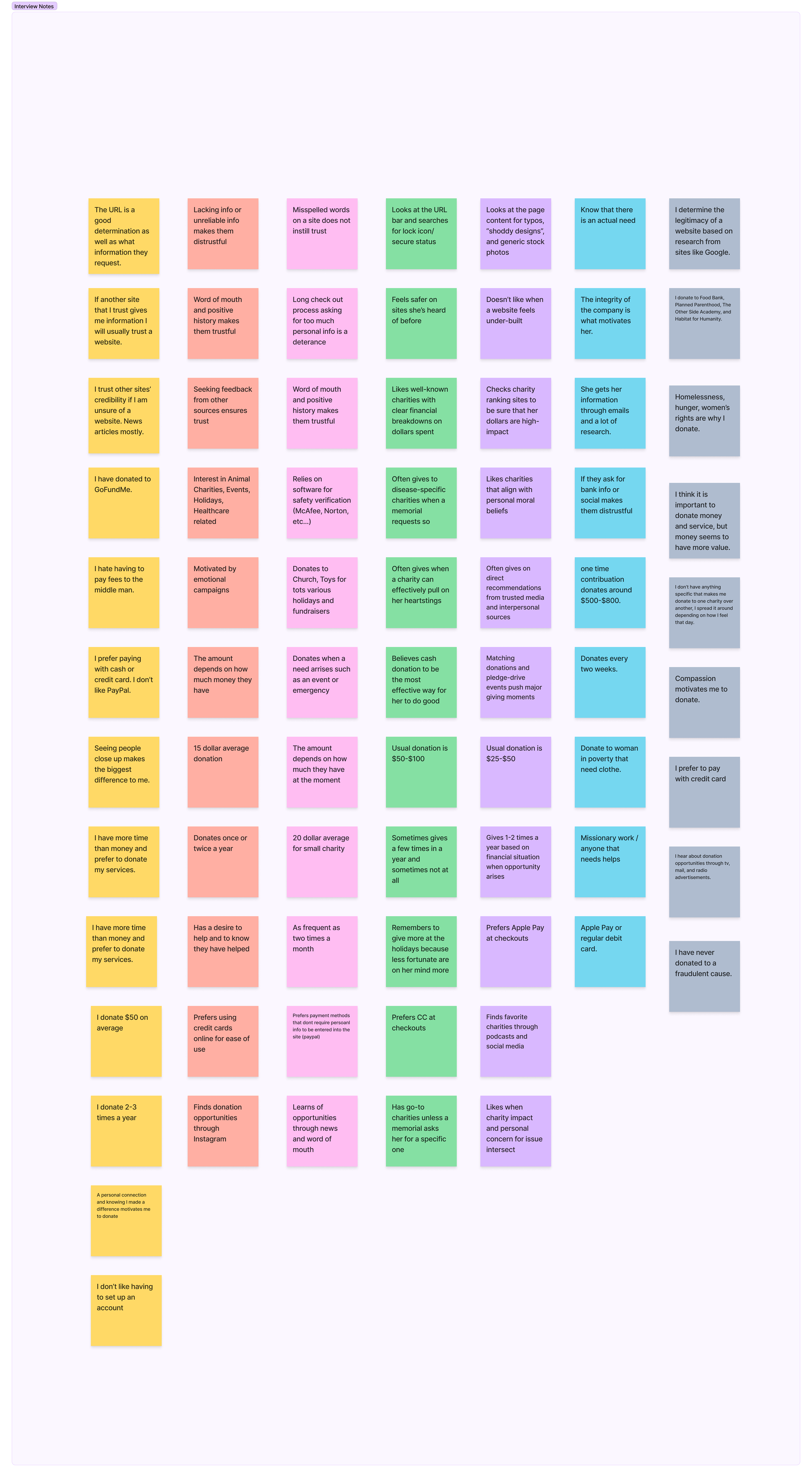
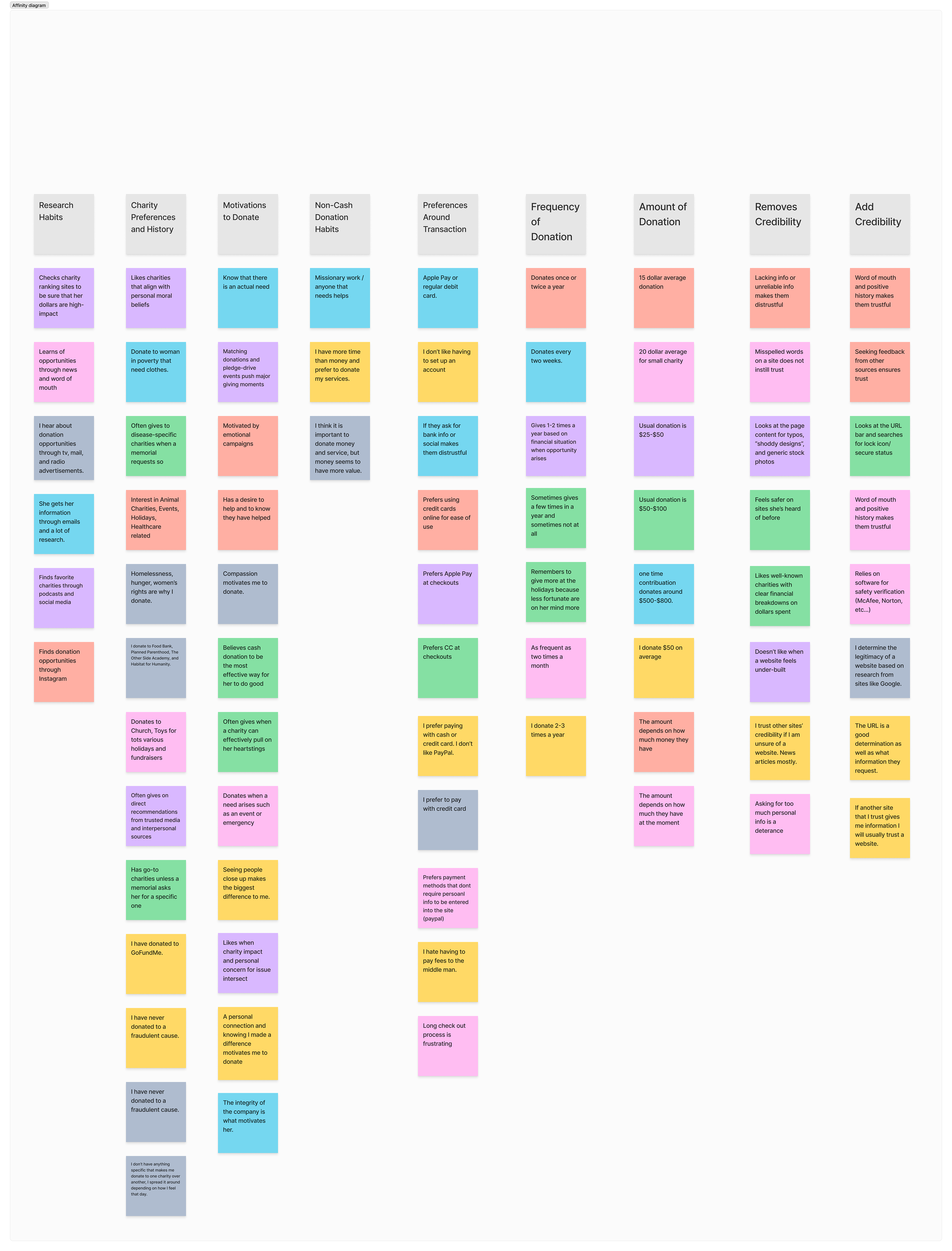
We continued by going back to our interview notes, mapping each of our responses to sticky notes. We then put these into distinct categories and iterated until we were satisfied with the results.
We then got out a new board. Using the categorized research answers, we suggested features using an exercise great for drawing out a broad scope of suggested features. Once we had a bunch of features, we voted with dots on each idea.
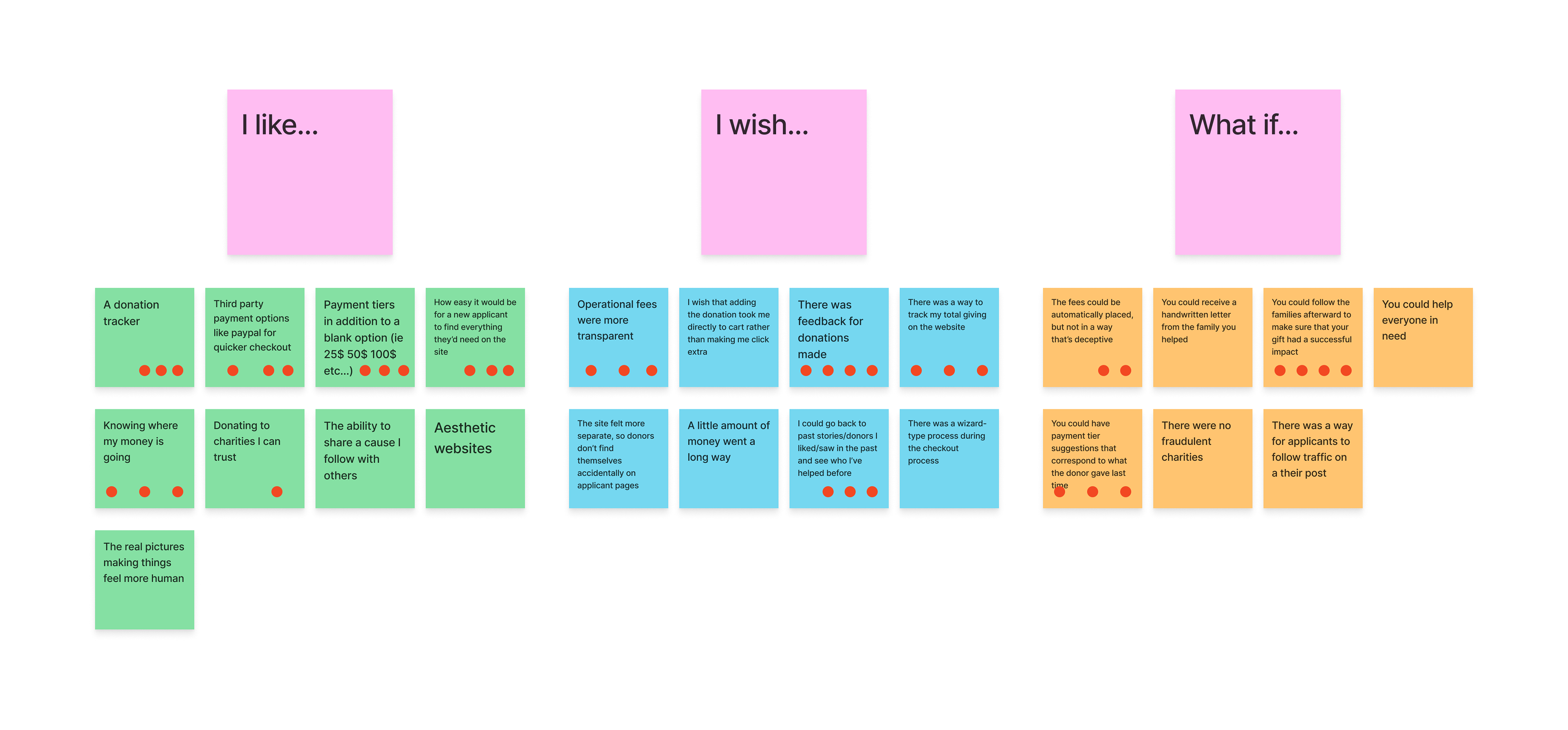
Next, every sticky note with at least one vote was evaluated on two spectra: ease of implementation and value to users. This helped us narrow our scope to better focus on what would make an impact for donors.
Reorganizing Content
At this point, the team worked on more distinct tasks. I chose to reorganize the information of the site to start. I began this by going through every page of ModestNeeds.org. As I went, I took notes on what areas of the site were defunct, which could be combined, and which areas needed more emphasis. Using this, I created navigation categories for the pages that remained, separating functional navbar options like logging in from their original placement.
In this new version, applicant pages were better separated from donor pages, so each user would be able to find the information they were looking for easier. Much of the information donors would be looking for was more condensed, so users weren't jumping between similar-seeming pages. I also added an "Impact Statistics" page, so potential donors could more easily find the data than many decide whether or not to donate on.
After some group feedback, I iterated on the page map to make the final version of the redesigned navigation map for Modest Needs.
Framing Applicants
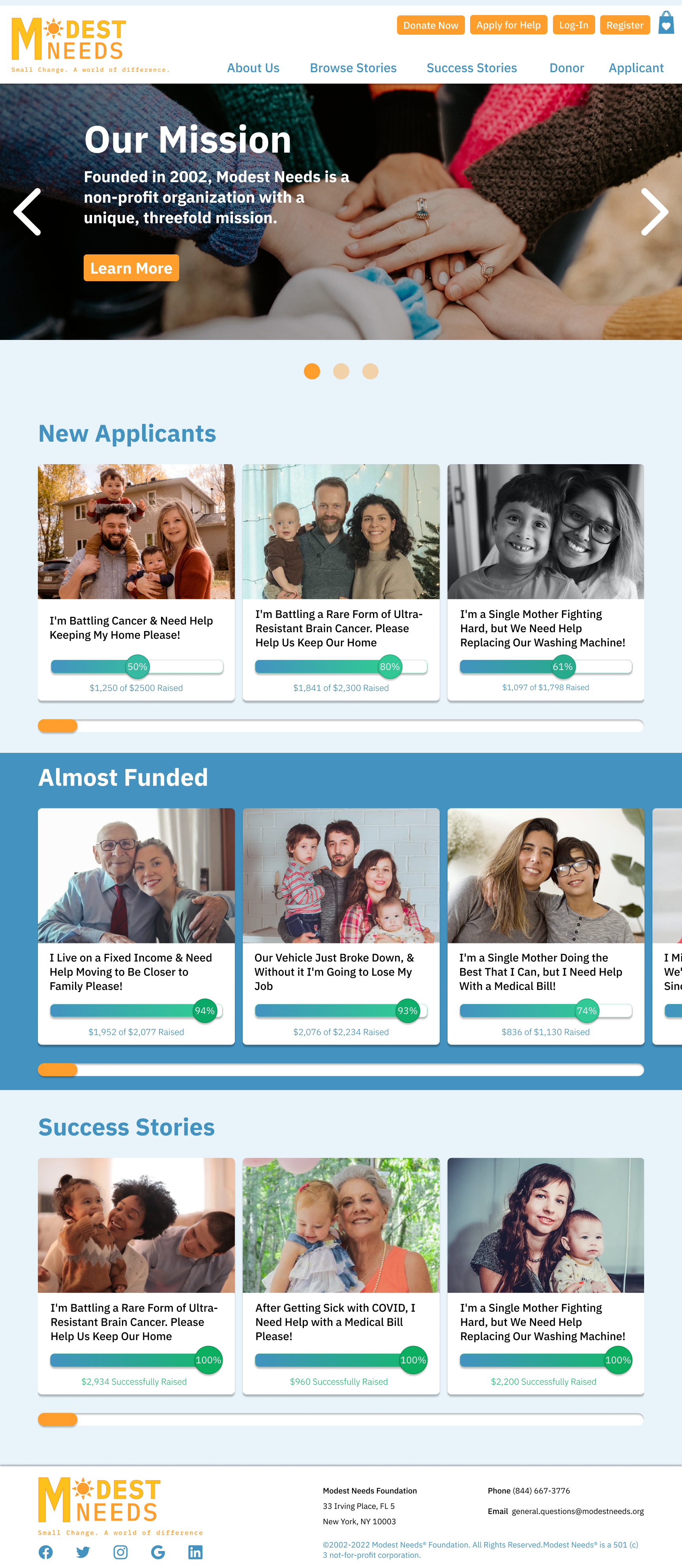
After finishing the site navigation, I turned my attention to my task of building the content cards that would be used to show potential donors the applicants they're helping. Through team feedback cycles and user testing, I was able to build the cards into a better frame for the applicants to make their case.
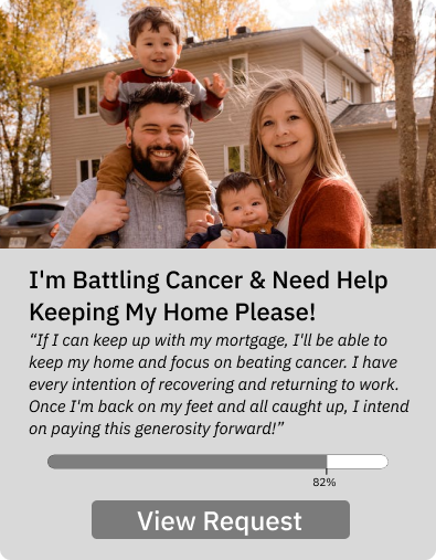
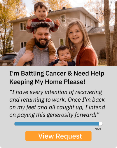
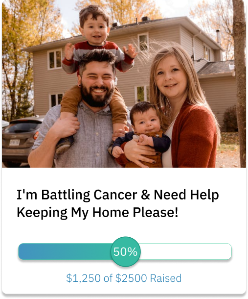
Through early user testing and team feedback, I distilled a final card with the goal to maximize the emotional appeal. I made enough cards to properly simulate the charity. In total, I made 40 cards, each with a hover state. All incomplete (goal not met) cards were also arbitrarily labeled as "Featured" or "Non-Featured". These distinctions will become important later.
For sourcing the images, I used free stock image websites. As for the headlines, I used actual Modest Needs requests to make the cards feel more like real people who need help. For the progress bar, I wanted it to feel like a knob that could be moved with a donation. I especially wanted progress bars nearing completion to catch the eye to hopefully encourage someone to go above and beyond their normal donation amount to complete the request.
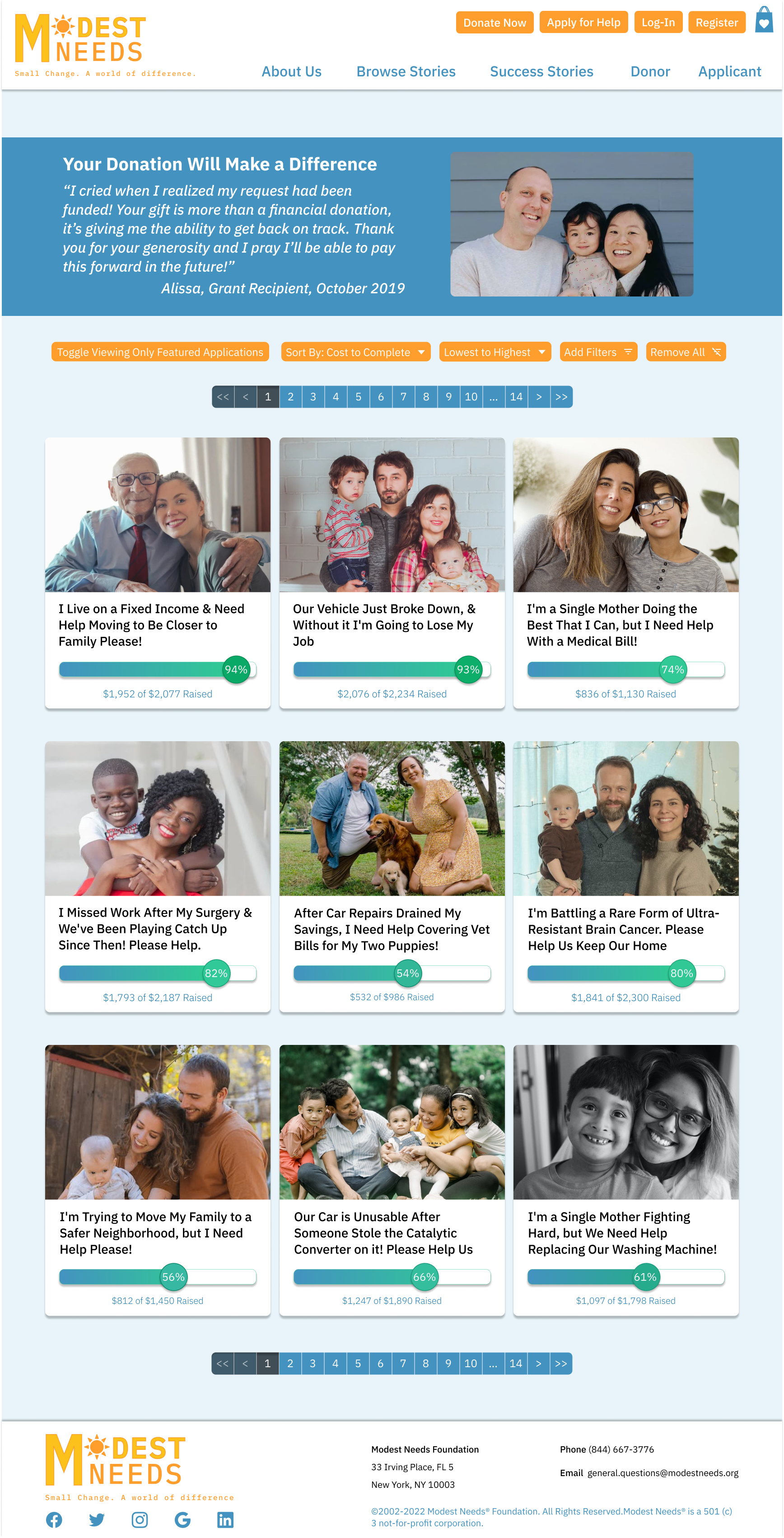
After the cards were settled on and approved, I moved on to building the Browse Applicants page. This page ended up requiring more Figma prototyping connections than the rest of the project combined.
The reason for this page being such a behemoth was to fully simulate the page for our demonstration. If Modest Needs is about getting help to the applicants, the applicant page should be a compelling cornerstone where you aren't distracted by elements that don't work.
To achieve this, I built out a set of sorting and filtering buttons combining some of the ones Modest Needs already had with a more intuitive layout. I then mapped out each possible permutation of the page (of which there were 12), built all the button components, and then linked them all up. I had originally intended for the filters and remove filters buttons to work as well. However, my mapping of how much time it would take relative to the gain told me it was best to drop it and focus on making what I had perfect.
Testing, Revising, and Finishing
At this point, we were on our third iteration and most of the site was built out. We finished building the last few pages together and then began to plan our usability tests. We decided to have users follow a similar path as we would go through in our presentation.
The site was well received, but it did get a few notes on parts to change. This was when my cards got the feedback that having a snippet of each applicant's message was a bit distracting and wasn't letting the user see the pictures to empathize with. My Browse Applicants page also got feedback that not having something before the applicants made the page feel bare. In addition, we got feedback about our margins being too small, how our checkout felt confusing, and how our General Fund page wasn't really getting across what is was for. As a group, we decided how to tackle these, and made the changes.
From these changes came our final iteration. It was a very work-dense project, but it paid off in the transformation from the original.
Try it Out
https://www.figma.com/proto/j3h5KWjdSREnNKoFGe2uYL/Untitled?type=design&node-id=0-1&viewport=919%2C1156%2C0.1&scaling=scale-down&starting-point-node-id=1%3A195
Copy and paste the link into your URL bar to view.
Be sure to check out my "Browse Stories" page when you're there!
